With the launch of ‘The Show Must Go On’, the AW17 scarf collection, our Digital Editor, Alannah, interviews Karen to find out more about her inspiration and design exploration.
There’s a scene in Breakfast at Tiffany’s where an anonymous ginger cat pads along the top of the kitchen counter and jumps on to the shoulder of a well-dressed man, who then steps into Holly Golightly’s famed party. There’s people everywhere and nobody is aware of what is happening around them. An extravagantly-dressed woman is laughing at herself in a mirror, while others dance and make attempts to allure millionaires, and somewhere lost in it all, there’s a phone ringing from inside a suitcase.
I imagine that if you could see inside Karen’s mind when she sits down at her drawing table, you’d see similar scenes unfolding.

As the summer waltzes into Autumn, the new scarf collection, aptly titled ‘The Show Must Go On’ will be released. When I asked where the idea for the collection originated, Karen started telling me about going to the ballet with her mum, last winter, to see The Red Shoes:
‘I love the co-ordination of the dancers and watching multiples of things really appeals to me, such as, people in matching outfits and objects all stacked up. The ballet is amazing because there’s dancers all dressed up in the same costumes and moving with perfect synchronisation. It’s like watching a kaleidoscope.’
Another of her favourite performances was La Bohème, a beautiful opera that she attended with her friend Claire, from Bee Waits For No One. She described her favourite scene, which was set in early 1900’s Paris on Christmas Eve, with bohemian poets, a carousel spinning around and snow falling on children wearing little velvet outfits decorated with pompoms.
‘Everything was happening at once, with a busker and a café scene alongside. It was so cool, when everything was happening right in front of you and you realise you can’t possibly see it all.’
I wondered how watching these ornate performances had translated into her designs and she described creating overwhelming ‘visual structures’. She drew from the colours, themes and the feeling of ‘when things are so nauseatingly stimulating because there is so much going on.’
Always keen to move forward and develop, Karen found the recent collaboration with Universal Pictures liberating because she only used three colours per design and let one symbol speak for itself. She related this to traditional printmakers in the forties and fifties, who worked in limited colour palettes and spent time getting each colour exactly right.
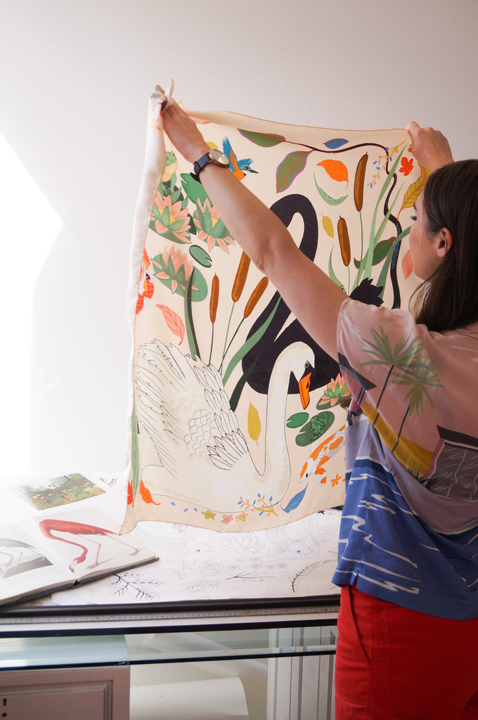
With one of the most impressive collections of artists books that I’ve seen outside of a library, Karen often looks to art for interesting colour combinations. She is inspired by artists, such as Gary Hume for his ability to colour balance ‘really satisfying colours’. She has also been looking at traditional book covers, lithographic printing and her collection of Italian screen-printed children’s books for reference:
‘For the swan design, I think I picked nine colours and worked within that remit so they balance out. It is a lot about proportion of colour. If you have a super bright colour, using it sparingly often works better in my opinion.’

Every illustration is hand-drawn by Karen, before she does the design work digitally. During a design phase, she likes to draw very early in the morning in quiet solitude:
‘People say you can only get inspiration when you’re already working and I think it’s true. You need to be in that focused environment so your mind can wander.’
She figured her favourite things to draw tend to be repetitive things, such as each individual poker chip on the Las Vegas print and anything with texture ‘like the skin of an avocado.’
‘Sometimes I have a super clear idea in my head for a drawing and I just have to go through the motions of getting there. With Swan Lake, I had it in my head, whereas with a pattern like Zodiac, I drew a few different elements and played around with it until I got a repeat that works.’
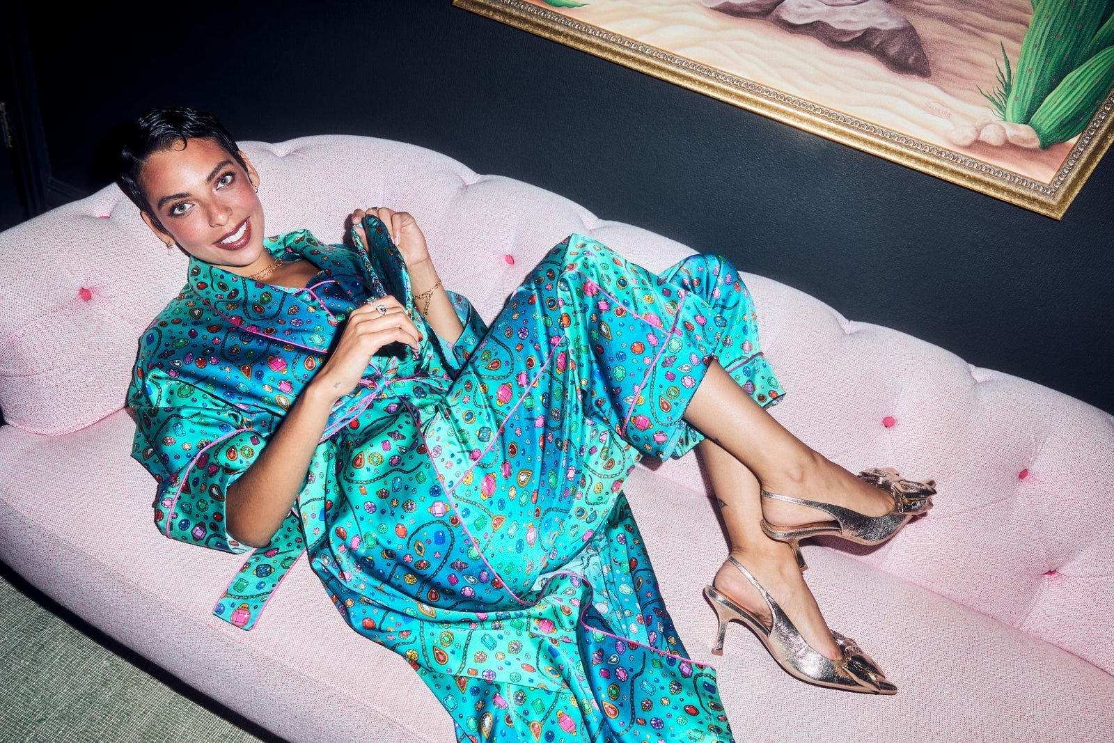
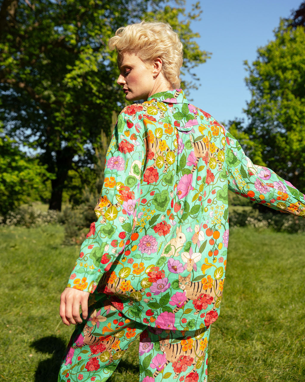
Each scarf in 'The Show Must Go on' is designed as a beautiful object that can be worn in such a number of ways that there is always different elements of the design visible, different parts of scenes being acted out. Shop the new collection here.